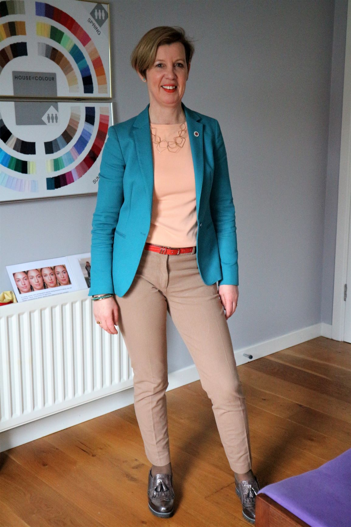
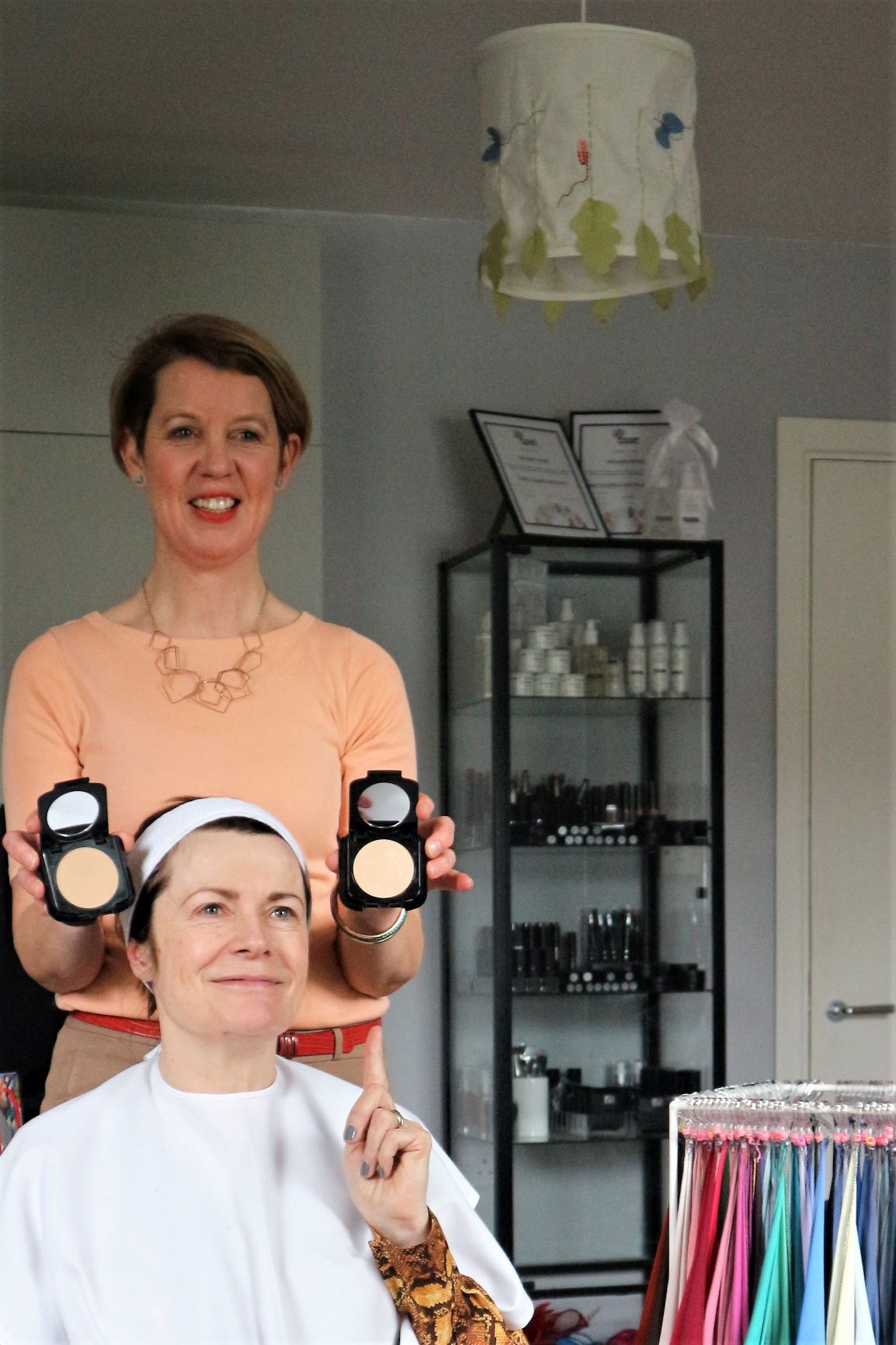
I recently spent a very pleasant few hours having my colours ‘done’ or analysed by House of Colour consultant Maria Macklin in her County Monaghan studio (below).
The process is fascinating. The basis of colour analysis is working out whether your skin colour is warm or cool. You might have an idea already. Check out the veins at the back of your wrist. If they appear blue, your skin tone is cool. If they look green, it’s warm.
Colour Analysis Theory
The theory behind colour analysis was influenced by the work of the great masters and their individual palettes. Think summer colours from Monet and autumn ones from Constable. Their work has been distilled into a system which groups colours into warm and cold. These are further broken down into four quarters of a colour wheel. The warm colours are Autumn and Spring, the cool colours Winter and Summer.

It’s not just about which colours each of us can or can’t wear. It’s about which tones of each colour work best for us. And what determines that is our hair colour, our skin tone and the colour of our eyes. I learned that the only people who can successfully wear true black and pure white are those who fall in the Winter section of the colour wheel. And true red is the only colour that suits everybody.
(Your primary colouring remains the same throughout your life, but going grey, colouring your hair or even getting a tan can alter how flattering certain shades appear.)
Maria put me sitting in front of a mirror and covered me with a white gown/ bib ‘thingy’. As you can see, I looked like death, although bear in mind that I was not wearing any make-up either, as the assessment has to be done with a bare face.
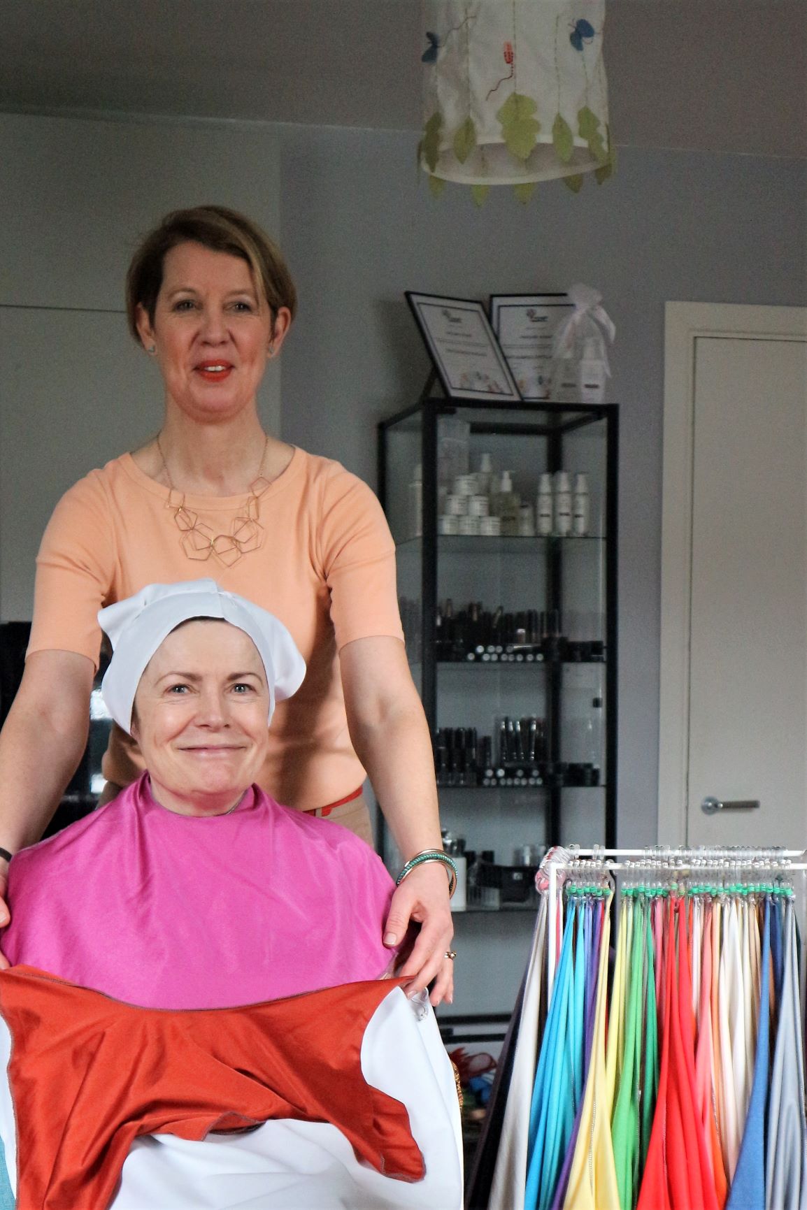
Warm Tones suit me best
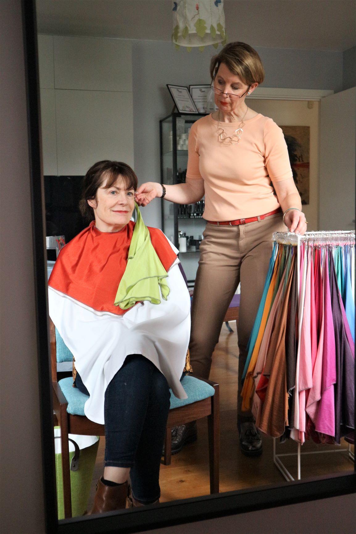
I wasn’t surprised to discover that warm tones suited me. This meant I was either Autumn or Spring when it came to the colour wheel. Then a series of different coloured scarves was used to work out into which season of the wheel I fitted. The difference was immediately obvious…I was definitely Autumn.
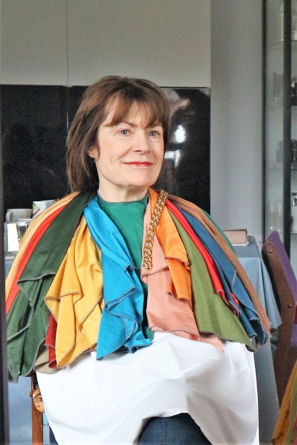
When those colours were near my face, I looked brighter, younger, more alive, more rested. I kid you not. I might not need that face-lift after all!
Eventually, I had around 14 different swathes of colour piled up around my neck and shoulders. They alternated good and bad colour choices against my skin. Then each of the Autumn-coloured scarves were tested against my face. And we decided which were excellent, which were very good and which should only be worn as accessories.
What Suits Me
- I am an Autumn
- Think greens, corals, orange, mustard, amber, browns, russets golds
- The colours of Autumn leaves
- Gold jewellery
I need to stay away from:
- Black and white
- Greys
- Bright pinks, baby pinks, light blues
- Silver jewellery
The session with Maria reaffirmed that black and white do not suit me and should never be worn near my face. I do have lots of black tops and jumpers and an expensive black lace dress in my wardrobe (never worn) has now been moved into the SELL pile. The jumpers can work with different scarves or jewellery.
Because the warm colours of Autumn are more suited to my colouring GOLD JEWELLERY is far more flattering against my skin than the cooler silver. Actually, I always knew this and generally choose to wear gold anyway.
Personal Colour Swatch
At the end of the session, Maria presented me with a wallet with my 36 colours and guidance as to whether the colours were best as an overall colour or as an accessory. It was most informative and in many ways confirmed what I knew, so why did I keep buying colours that did not flatter or enhance my face?
Look, I am not throwing out the third of my wardrobe which includes my wrong colours YET. I will see if I can make them work for me, but I do believe that my future purchases will be influenced by that little colour swatch that is now a permanent fixture in my handbag. And I can see that it already makes shopping easier. I now gravitate to ‘my colours’ and ignore the rest.
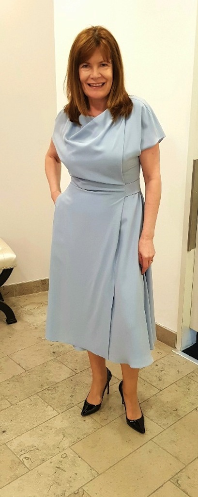
Below you can see an example of a colour that did not work for me. This pic was taken when I was on the hunt for my mother-of-the-bride dress.
The session also included a make-up session and I purchased a rust and a red lipstick but I am going to find it difficult to ditch my bright pinks.
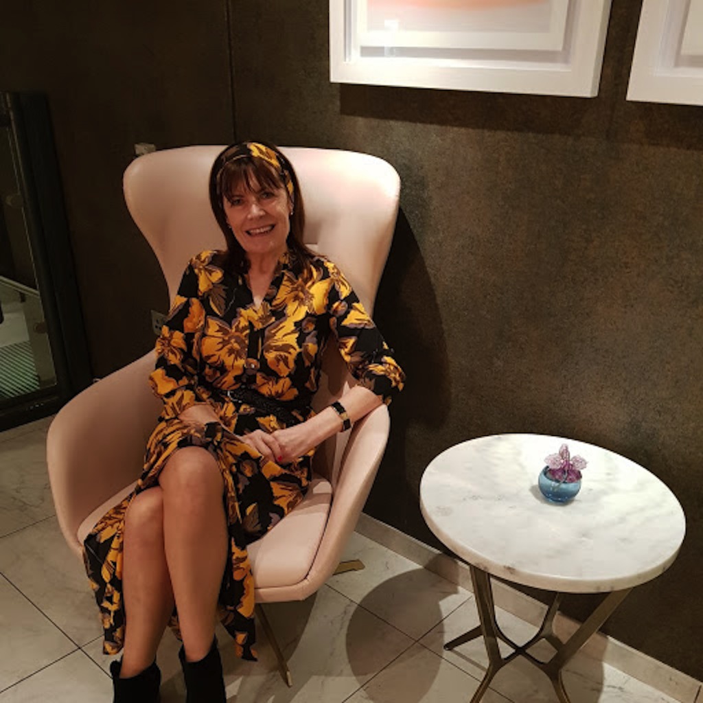
When it comes to prints (which I love) the recommendation is that the predominant colour (80%) should be in your palette. A good example is the dress below from Selected.
A House of Colour session with Maria near Carrickmacross would make the perfect, fun ‘Girls’ Day Out’ with three or four friends, or you can always avail of her services individually: it would be money well spent.
‘Colour is a power which directly influences the soul’, according to the late Russian artist Wassily Kandinsky, so if you are unsure, as many of us are, or need confirmation as to what your best colours are, get to a colour consultant.


What an excellent post you’ve written!! I have had my colours done as well and it was an amazing experience. I was right on about half the choices I was making, but there were definitely wrong choices too. I love the picture where you are draped in all the colours. It’s easy to see what works well for you and your colouring and I love the print dress you are wearing in the last photo.
Thank you for sharing such wonderful advice. I think every woman deserves this opportunity because it’s such a time and money saver when it comes to buying clothes and accessories. Thanks for sharing!!
Pamela thank you for commenting. You are right, it really is amazing what a difference the right colours make. You glow….
Excellent post! I’ve never had my colors done but will now actually consider it. The autumn colors definitely pop against your skin color. I imagine that your shopping experiences are more focused and less time consuming now. Thanks for sharing!
Yes Michell I always kind of knew, but now I know, so I think it will make a huge difference.
This is so interesting, I didn’t think I’d had one of these done, but seeing your blog i did years ago! I can’t even remember what i was and the colours that i should be wearing. I do wear a lot of different colours and find that creams and light colours don’t really suit me. I need to have the proper test done, don’t I! thanks for sharing. I will be looking into this. Jacqui Mummabstylish
Thanks Jacqui. It is certainly an interesting exercise and will probably corroborate your own thoughts and instincts.
Hilda this is fascinating! I would love to have my colors analyzed and I’m going to look into it! I am much more drawn to some colors than others and I wonder if this is just my intuition telling me which ones are best for me. Either way, I loved this post!
Thanks Suzanne. It was very interesting, and I think we instinctively know what works, but it is good to see it.